Dots In Typography
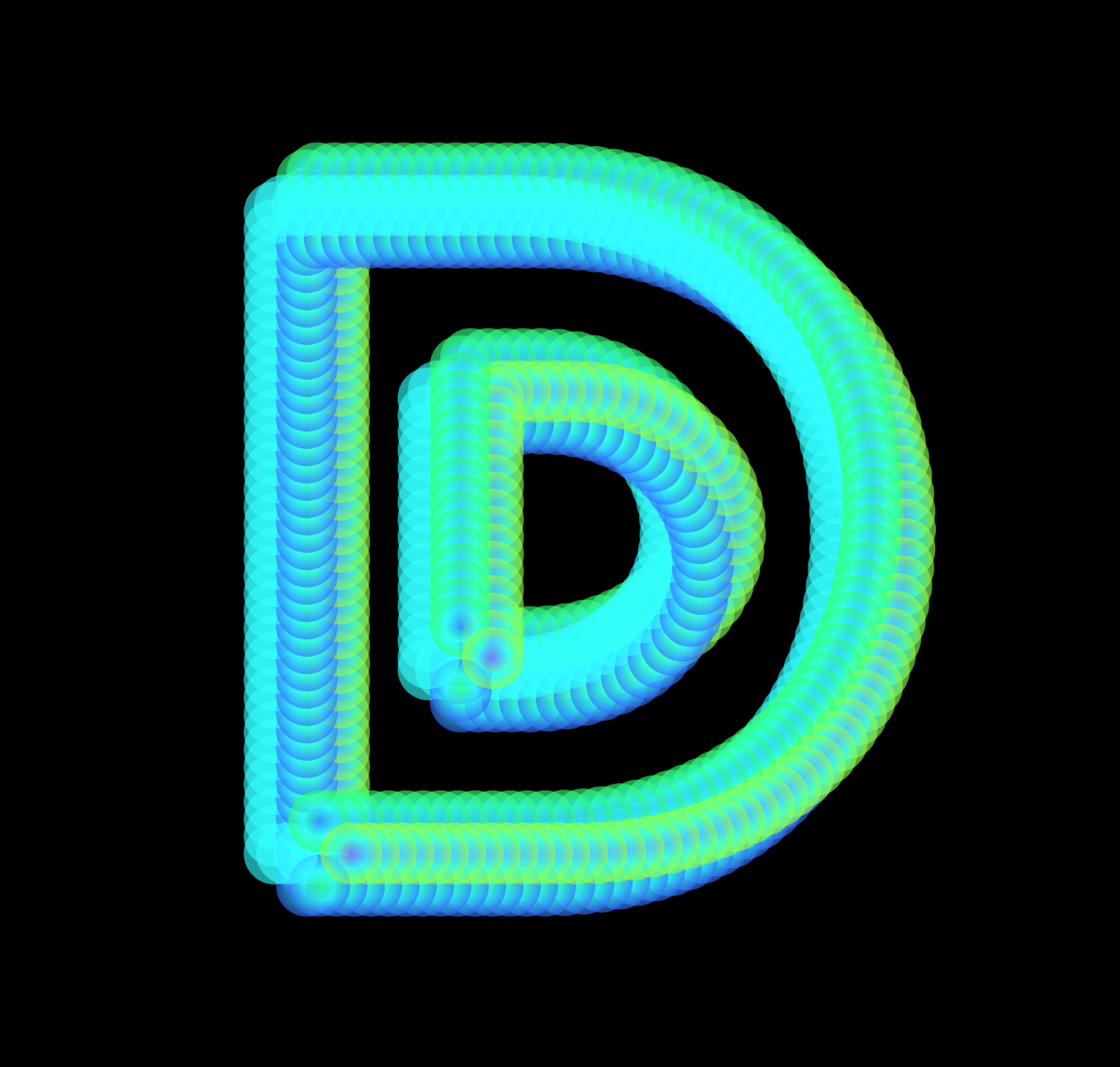
Animated Dots use geometric shapes and gradients to enhance the form of a letter. Shapes are placed along the character's path, creating a cohesive pattern that emphasizes its structure. While complementary color gradients were initially used, a grayscale option was added to offer a cleaner and less visually overwhelming alternative. Rotating circles add dynamic movement, making the design visually engaging. The combination of static paths and dynamic gradients highlights patterns and repetition, aligning with the theme of creating compelling visual structures.
Soap Bubbles Effect
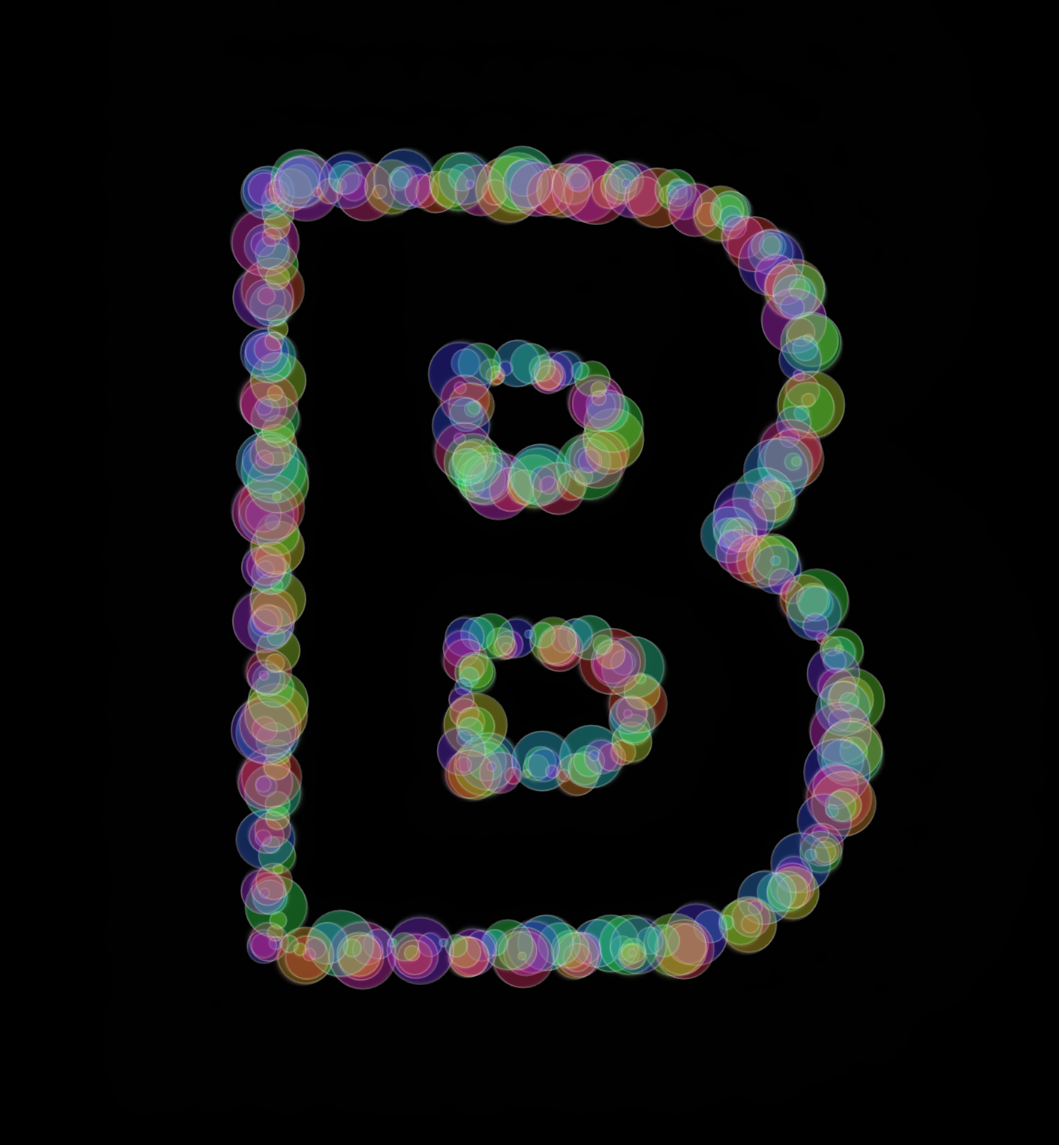
Bubble Effect was created unexpectedly, inspired by overlapping circles that looked like soap bubbles. The design started simple, but by adding a stroke parameter, the bubbles became more detailed and realistic. This made the design more dynamic, but still gentle on the eyes. Unlike the other sketch, which has strong colors and gradients, this design is much softer and easier to look at. The smooth, rounded shapes and subtle strokes give it a calm and natural feel.
The movement of the bubbles adds light quality to the design, and their overlap creates a sense of depth. The repeated shapes form a nice rhythm, which ties into the theme of patterns. The sketch avoids feeling too busy, keeping a balance between simplicity and movement. The bubbles’ smooth transitions make the design feel natural and relaxing. This approach focuses on creating a pleasant visual experience that is both engaging and easy to enjoy.